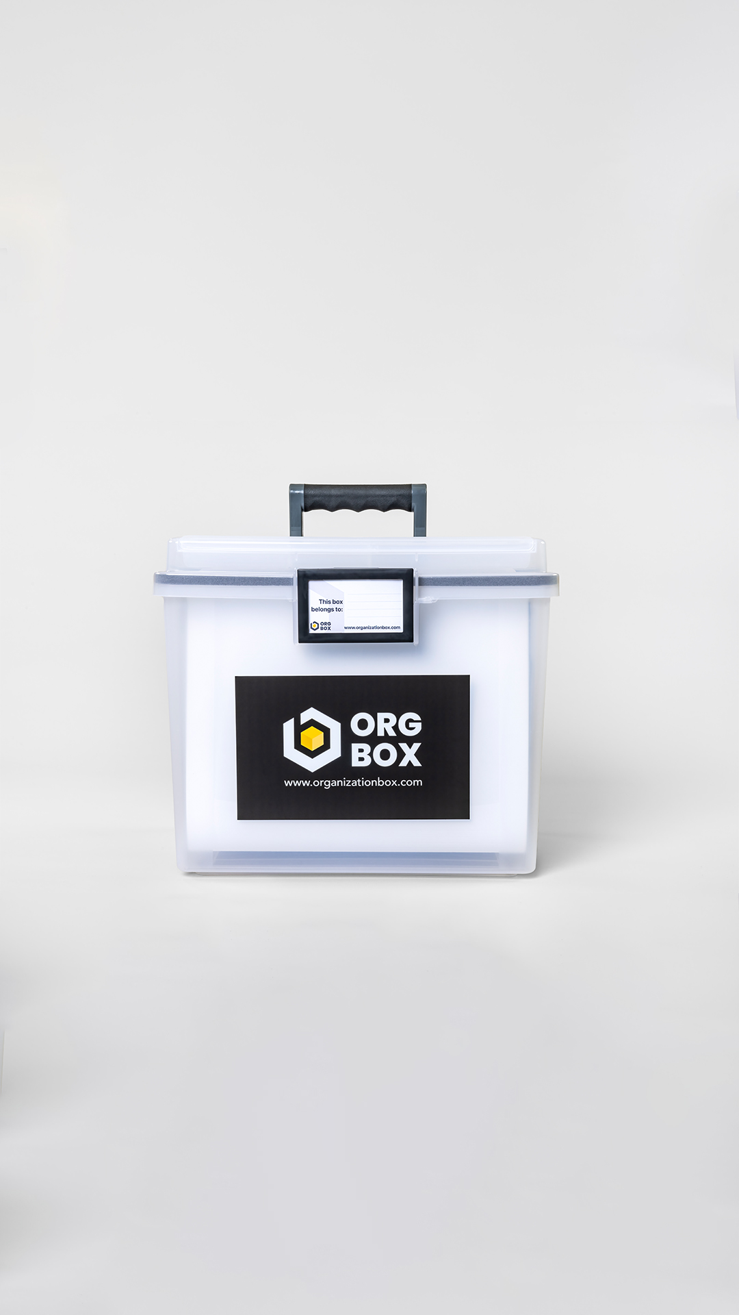
Org Box is a modern storage solution built specifically for parents, helping them keep life’s most important documents safe, accessible, and neatly organized. With a strong focus on ease and peace of mind, Org Box transforms the often stressful task of paperwork management into a streamlined and empowering experience
Visual Identity.
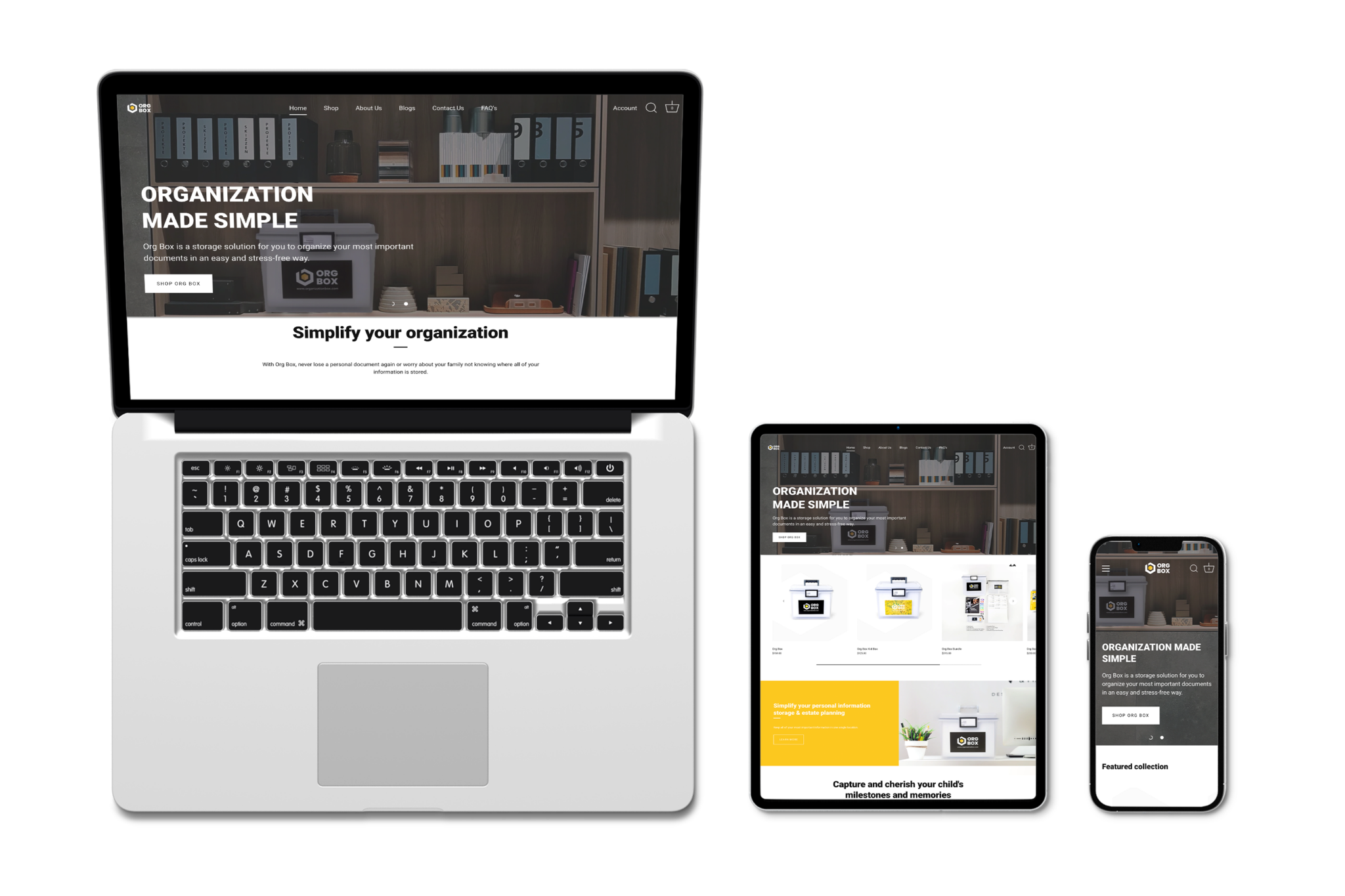
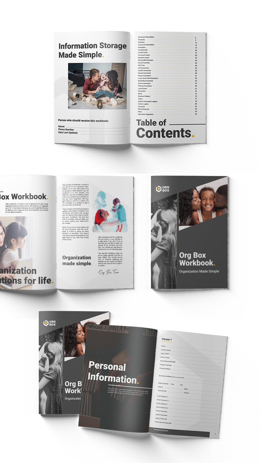
I took a brand-first approach to create a cohesive, intuitive, and deeply strategic identity for Org Box—designed to resonate with modern parents and make organizing feel effortless.
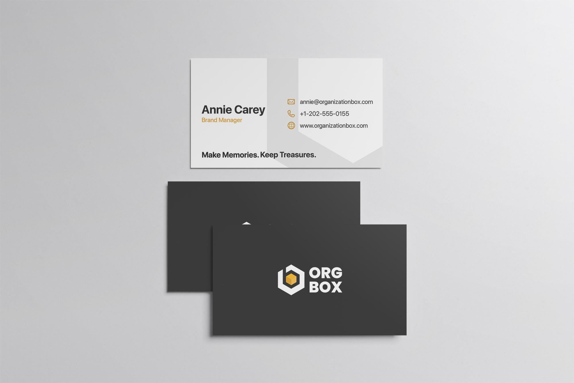
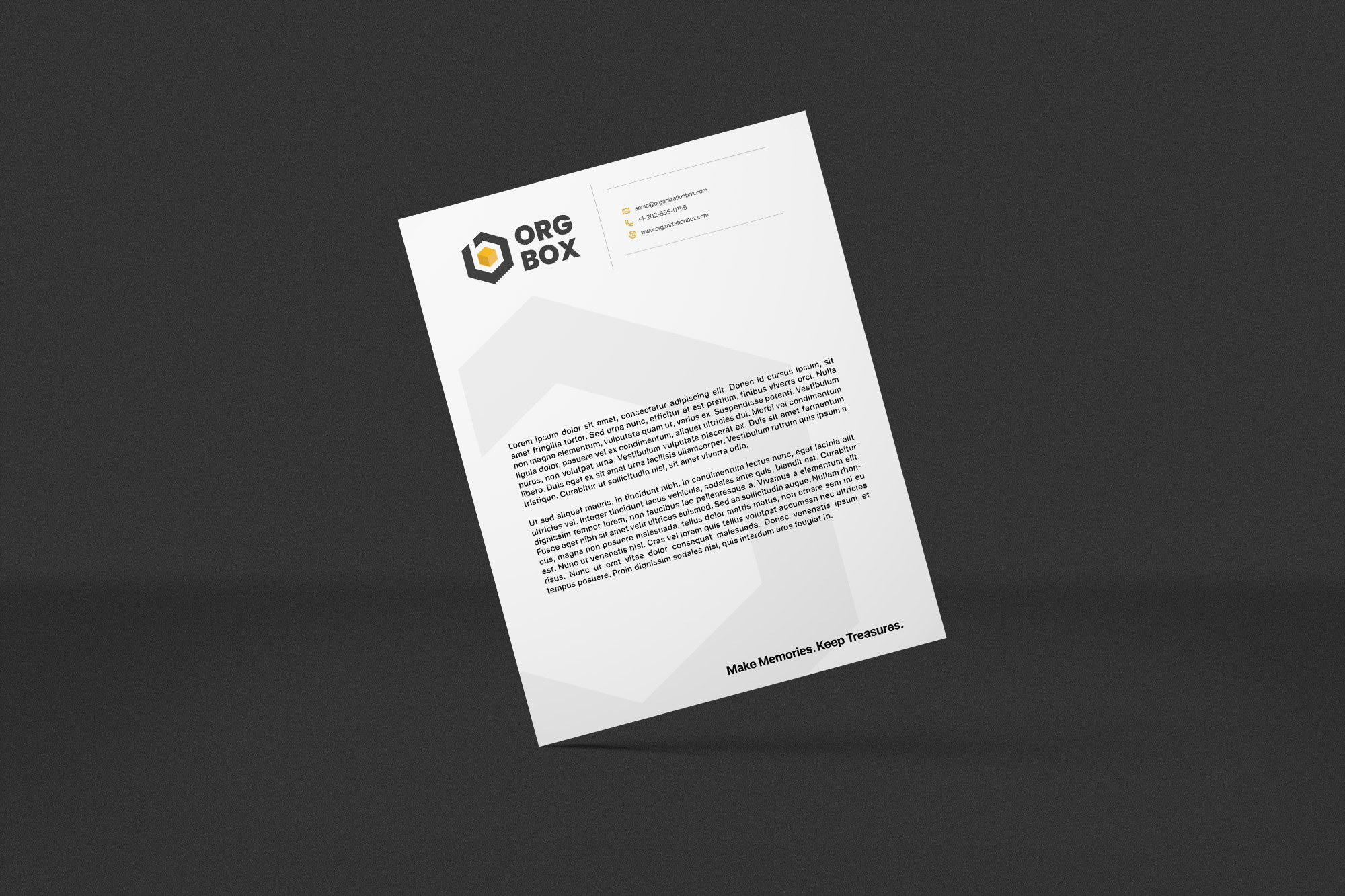
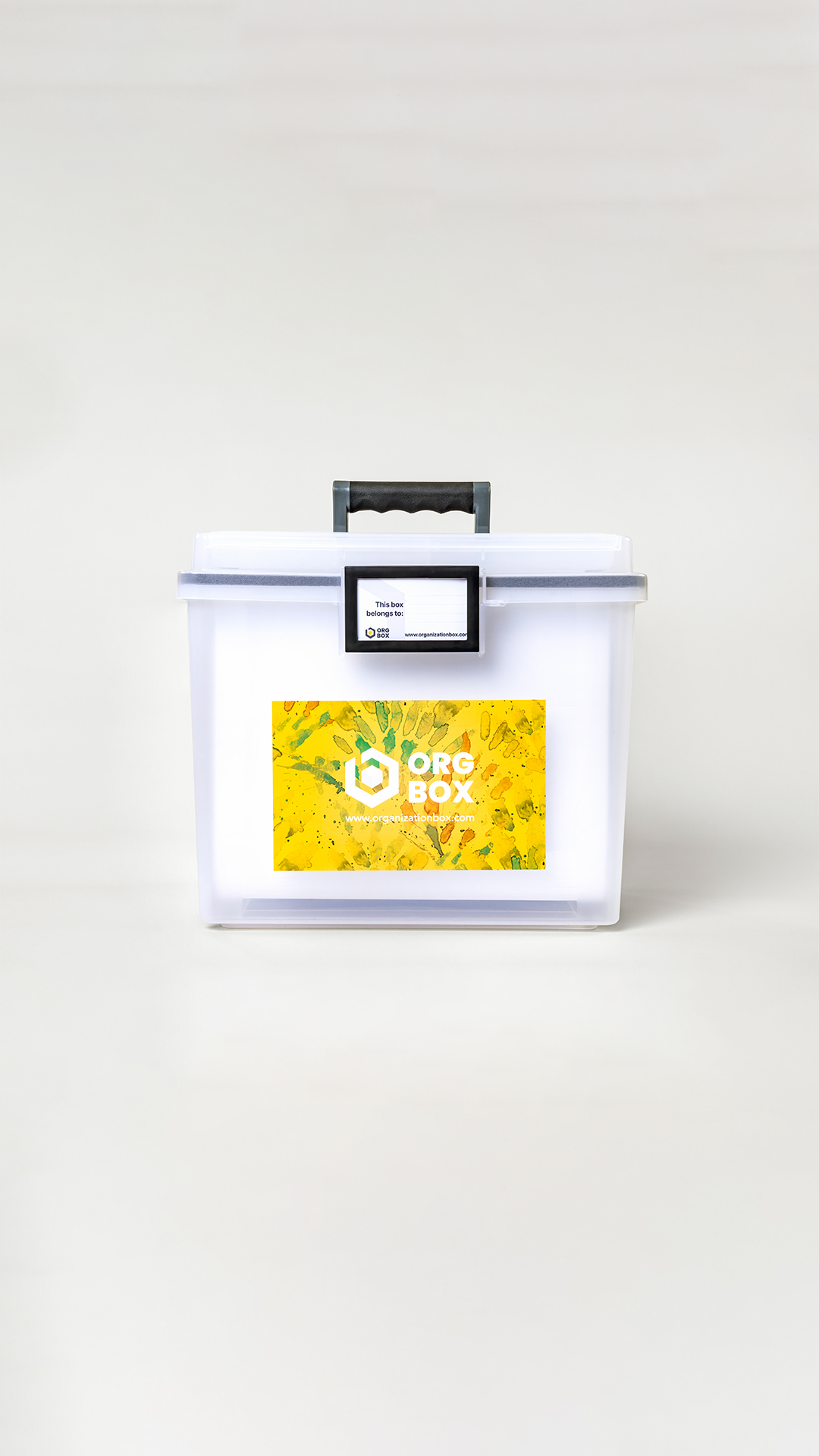
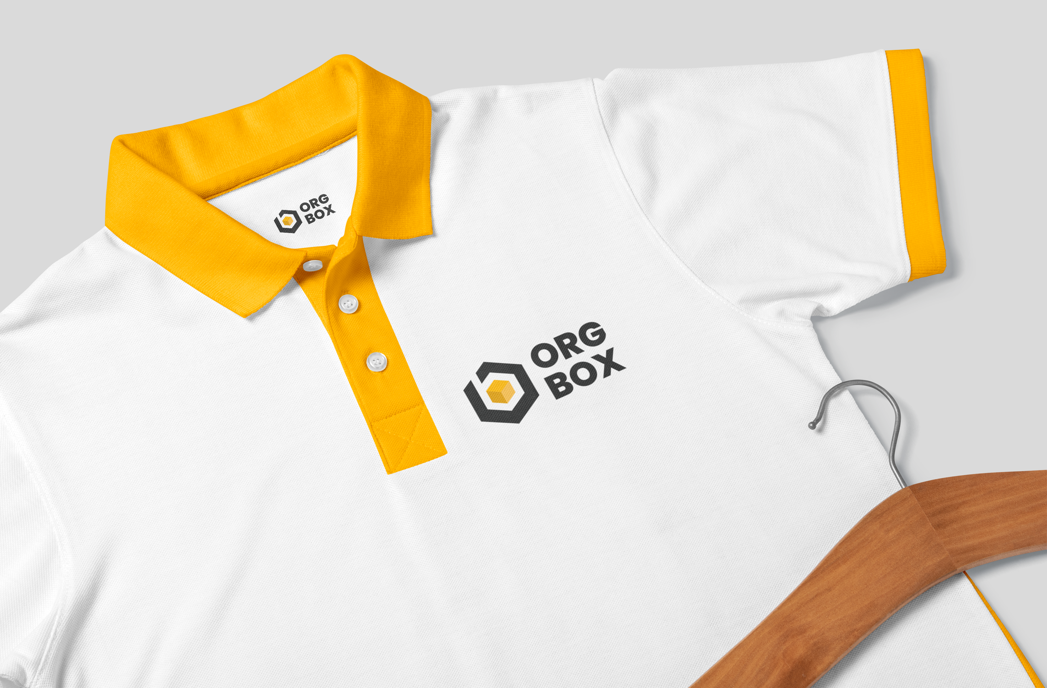
The Org Box logo, built around the concept Calm Within the Box, features a minimalist square icon that symbolizes structure, containment, and clarity. Its clean lines and bold form reflect strength and simplicity, while the box represents both a literal container and a metaphor for mental clarity and peace of mind. Paired with a modern sans-serif typeface, the logo delivers a polished, professional impression.
For the visual language, we chose a deep grey to anchor the palette—conveying maturity, dependability, and calm—complemented by soft neutrals and muted tones that evoke a clutter-free, stress-free environment. The design system embraces white space for breathability, grid-based layouts for order and harmony, and gentle illustrative icons to guide users through each interaction with ease.